Peugeot change their logo for upmarket move
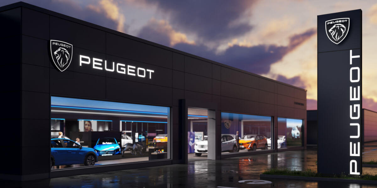
Gone is the standing lion and in is the new Peugeot logo. The company has announced that it will change its branding to match its move upmarket. Created by the Peugeot Design Lab, it now features a coat-of-arms-like shield with a lion’s head on it. This is adorned with a new and more simple typeface for the brand name.
Peugeot has had ten logos since it was established in 1850. Now in 2021, this will be the eleventh logo that is described as “more streamlined, more qualitative and more elegant”.
The new Peugeot logo will complete its rebranding in two years.
Peugeot says the change needed to happen for the brands move upmarket and will gradually envelop the brand over the next two years. By 2023, Peugeot plans to have completely rebranded itself.
This change has already happened online with newly designed websites that feature the new logo. All promotional material will also take on the new logo immediately as dealerships make the change too.
The first car that will feature the new logo is the next-generation Peugeot 308 hatchback. With plans to be unveiled this year, 2021, we can also expect a completely new design that follows that of the 208 and 2008.
Upmarket usually also means more expensive. We hope that this is just a style change to make a more affordable upmarket car instead of a start to exclude their entry-level market. We do like the new design though and look forward to seeing what it will look like on an actual car.
Below is the teaser release from Peugeot South Africa on Twitter.
Introducing the brand new face of Peugeot. #LionsOfOurTime #PeugeotZA pic.twitter.com/tBcTee3Bw6
— Peugeot South Africa (@PeugeotZA) February 25, 2021
Source: Peugeot


