New Citroën brand identity and logo
Citroën is today revealing a fresh corporate brand identity and logo, signaling a bold, exciting and dynamic new era for the 103-year-old brand is underway as it accelerates its mission to make electric mobility accessible to all and extends its core DNA for affordability, audacity and customer wellbeing.
Article by: Citroën
The new look reinterprets the original logo first adopted by founder André Citroën, inspired by the success of his first metalworking company producing chevron-shaped ’herringbone’ gear systems. The familiar and technical “deux chevrons” reference has remained at the heart of Citroën’s identity ever since.
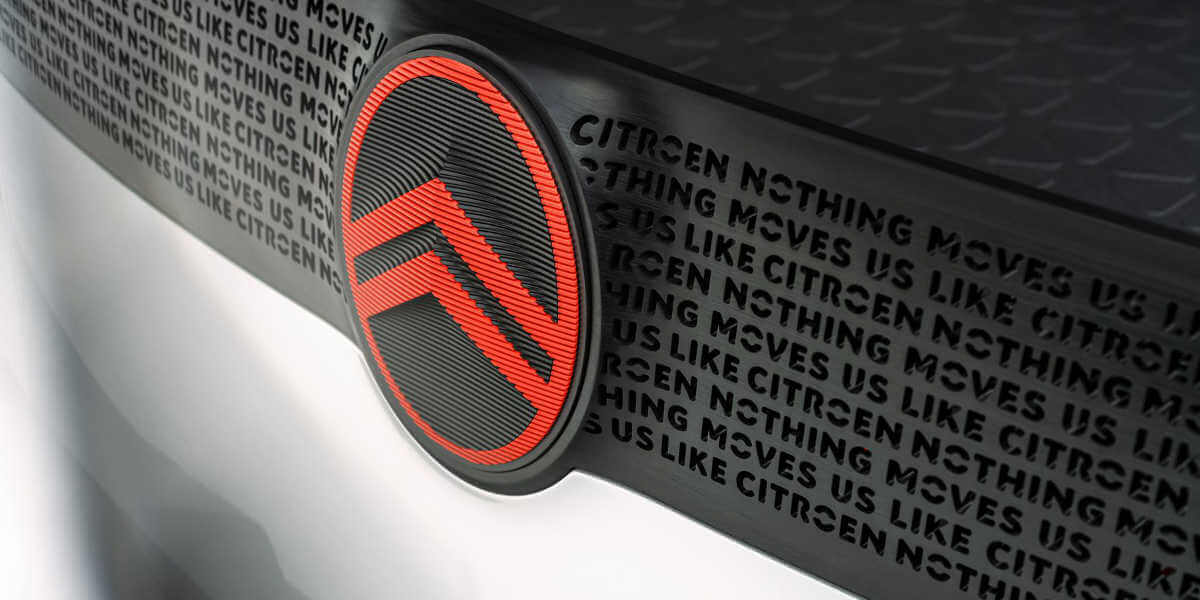
The elegant new emblem signposts the brand’s transition and evolution, and will debut at the end of September on a significant conceptual Citroën family vehicle. Versions of it will then progressively enhance future Citroën production and concept vehicles from mid-2023 on. The prominent, enhanced vertical oval will introduce a new direction in design language in which the visually prominent badge will become an immediately recognizable signature element of all Citroën models.
Complementing the new logo is a fresh corporate brand identity programme and the appearance of a new brand signature, which promises “Nothing Moves Us Like Citroën”.
Citroën CEO Vincent Cobée says: “As we embark on probably the most exciting chapter in our illustrious 103-year history, the time is right for Citroën to adopt a modern and contemporary new look. Our new identity is an elegant symbol of progress as we move our customers physically in daring, forward-looking vehicles that challenge traditional industry rules, and emotionally by ensuring their entire experience – particularly going electric – is more affordable, comfortable and enjoyable whatever their wants and needs. Our legacy of inspiring consumers with daring and revolutionary vehicles is energising us to adopt a different, more inclusive approach to future family mobility, and we firmly believe that customers past, present and future will agree that nothing moves us like Citroën.”
1. NEW BUT FAMILIAR
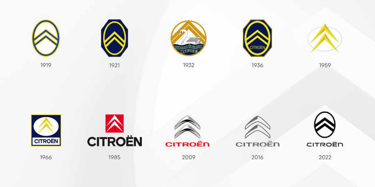
Central to the new brand identity is the evolution of Citroën’s world-famous “deux chevrons” symbol – the tenth significant revamp of the Citroën logo since the formation of the company in 1919 – and features wider and more prominent chevrons contrasted and surrounded by a softer vertical oval frame.
Significantly, the more prominent, enhanced vertical oval will initiate a new direction in product design language in which the visually prominent badge will become an immediately recognizable signature element of all Citroën models.
Citroën’s Global Brand Designer Alexandre Revert says: “As we look to clarify our future focus, it was logical for us to close the loop by coming back graphically to André Citroën’s first logo which represented the genuine promise of affordable and innovative mobility for all. Progressively moving to a more prominent and visible brand signature for our future designs is a significant if subtle evolution, where the precision of the technical, functional chevrons are embraced by and contrasted with the warmth and almost human softness of the oval that surrounds them.”
Supporting the new vertical oval logo is a fresh and comprehensive corporate identity programme which acts as a further and timely indication of how Citroën is accelerating its commitment of making electric mobility accessible to all while maintaining and extending its core DNA for accessibility, audacity and customer wellbeing.
A key objective was to embody elements inspired by more intimate non-automotive brands, including cosmetics and apparel, to convey a warmer expression of the brand that is easy on the eyes when experienced in different settings. For example, the new identity has been thoughtfully crafted with a pure and simplified user interface, providing customers with an enhanced sense of serenity for their entire digital journey with Citroën, from living room to showroom.
Particular care has been given to the design to ensuring the digital experience meets the expectations of new customers for ergonomics and aesthetics – including providing a ‘dark mode’ option – and fully meets the exacting needs and requirements for online sales.
In addition, a new animatic language is under development to integrate the new identity in all digital touchpoints, both inside the vehicle through HMI screens and outside in the My Citroën App, providing customers with an enriched and coherent Citroën experience.
The new identity will also extend beyond the digital environment and use of the new logo on and in vehicles to embrace all elements of the company’s corporate identity, from merchandising and documentation to dealership and corporate building signage. Efficient new signage will be lighter and energy saving, as well as chrome free to increase recyclability.
The comfortable and familiar “La Maison Citroën” retail interior concept will also continue to be enhanced as it has proved to be popular with customers since its introduction several years ago.
A fresh, simplified colour palette and new lettering evolved from Citroën’s current proprietary fonts will complement the logo and further enhance the new brand identity.
While white and cold grey provide a basis of serenity and easiness, two signature colours will be introduced as contrasting punctuations to be applied in details and specific areas.
Inspired by an important legacy colour for Citroën which has been used on iconic cars throughout the company’s history including the 2CV and the DS, the calming Monte Carlo Blue will be making a welcome return to the car portfolio in the near future, as well as featuring in details of the brand identity palette for corporate and retail applications.
Additionally, a more energetic and distinctive Infra-Red will replace the currently used red to add balance and dynamic contrast in physical, print and digital applications.
The new brand signature – “Nothing Moves Us Like Citroën” – will start to be used selectively in corporate and product communications and activities.
2. EVOLUTION AND REVOLUTION
Citroën’s evolutionary new brand logo and corporate identity combine with the “Nothing Moves Us Like Citroën” signature to highlight the coming revolution in the brand’s approach to future accessible mobility solutions and its commitment to stress-free customer services.
The first physical evidence of this will be explored in a significant conceptual family vehicle, which will carry the new identity and be revealed by Citroën at the end of September.
Laurent Barria Head of Citroën Marketing and Communication says: “By embracing our roots and reinterpreting our identity in a modern way, we are sending a clear message to everyone that while we’re staying true to our brand DNA, things are changing dramatically at Citroën.
We continue to look at things differently in our mission to create daring solutions that make electric mobility more accessible, and we’re determined to prove to our customers and to ourselves that nobody and nothing moves us like Citroën as we extend the emotional wellbeing we experience inside the car to outside of the car through the entire partnership journey they take with us.
It requires revolutionary thinking in everything we do, from the innovative vehicles we create to the inclusive, responsible services we provide, and it requires us to express and stand by our unique approach. That is exactly what we are promising to do today.”
Developed by the Citroën design team, the new Citroën identity has benefited from the expertise of Stellantis Design Studio, the global brand design agency of Stellantis dedicated to internal and external clients.

